Organizing Playbook in the Canvas
The playbook canvas is where you build and edit flows visually. Use the tool panel, Edit Menu, multi-select, and drag-and-drop to add actions, connect steps, disable nodes for testing, and Group actions into components. See ComponentsComponents for component details and the New Component dialog.
Starting in Turbine 26.4.0, the canvas also shows clear warnings when a referenced component, connector action, trigger, application, asset, or related object is missing or you do not have access — see Missing or Inaccessible Entities.
Canvas Tool Panel
The Canvas includes a floating tool panel in the top-left corner that provides quick access to commonly used actions while building and editing playbooks.
This panel stays visible as you work, allowing you to easily interact with the Canvas without navigating away.
Tool Panel Options
The tool panel includes the following options:

The screenshot above may not show Add Annotation if it was captured before that control shipped. Use the table below for the current tool panel.
Option | Description |
|---|---|
Build with Hero AI | Opens the Hero AI panel in Playbook Building Mode. Use natural language to create or modify flows. See Create and Modify Playbooks with Hero AI. |
Toggle Add Panel | Opens or closes the Add panel on the left side of the Canvas. Browse and drag triggers, actions, and components into the playbook. Shortcut: ⌘⇧A (Mac) / Ctrl+Shift+A (Windows). |
Add Annotation | Toggles annotation mode so you can add sticky-note annotations on the canvas. Click the canvas to place an annotation, format text in the annotation toolbar, and use Hide All Annotations from the annotation or Edit menu when you want a clean view. Annotations save with the playbook container. |
Edit Menu | Quick actions for nodes and annotations (cut, copy, paste, disable, hide annotations, and so on). See the Edit Menu table below. |
Undo / Redo | Reverse or restore canvas edits. See Undo and Redo below. |
Edit Menu
The Edit Menu provides the following quick actions for managing nodes (actions, conditions, loops, and so on) and annotations within a playbook.
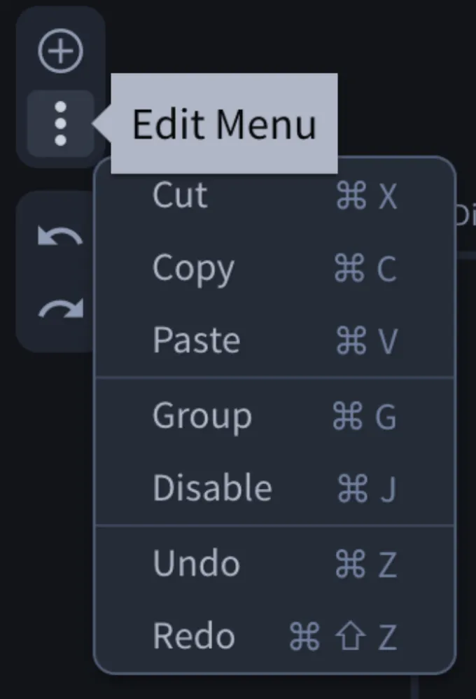
Option | Description | Shortcut |
|---|---|---|
Cut | Removes the selected item and copies it to the clipboard | ⌘ X |
Copy | Copies the selected item | ⌘ C |
Paste | Pastes the copied item into the Canvas | ⌘ V |
Group | Groups the selected action(s) into a new component (playbook canvas only) | ⌘ G |
Ungroup | Splits a selected component back into individual actions (when a component node is selected) | ⌘ ⇧ G |
Disable | Disables the selected item without deleting it | ⌘ J |
Delete | Removes the selected node from the Canvas | Delete or Backspace |
Undo | Reverts the last action | ⌘ Z |
Redo | Reapplies the last undone action | ⌘ ⇧ Z |
Show All Annotations / Hide All Annotations | Shows or hides sticky-note annotations on the canvas | Shift Y |
Show Minimap / Hide Minimap | Toggles the canvas minimap | ⌘ ⇧ M |
Some options appear only when the current selection supports them (for example Group when multiple actions are selected, or Ungroup when a component node is selected).
Undo and Redo
The Canvas includes Undo and Redo buttons for quickly reversing or restoring changes.
- Undo reverses the most recent action
- Redo reapplies the most recently undone action
Key details:
- Supports up to 30 undo and redo actions per session.
- Applies to all Canvas changes, including:
- Drag-and-drop Actions
- Edit menu actions (cut, copy, paste, disable, and so on)
- Configuration and editing steps
- Undo and redo are only available during the current editing session.
- Once the playbook is saved, undo and redo history is cleared and cannot be used.
- Webhook Trigger limitation: Undo and redo are not supported after generating a Webhook URL. Once you click Generate URL, the configuration changes are saved to the backend. Since undo/redo applies only to UI changes, these updates cannot be reverted.
- Configuration changes are grouped: Undo/redo does not track individual field changes inside the configuration panel. Instead:
- All changes are grouped when you click Apply
- A single Undo will revert all configuration changes made in that session
- A Redo will reapply them together
Use these controls to quickly correct mistakes or test changes while building your playbook.
Group Actions into a Component
Group turns selected playbook actions into a reusable component without leaving the canvas. For naming rules, saving, and ungrouping, see Create a Component from Playbook Actions in ComponentsComponents.
- In a single flow, hold Shift and drag across the canvas to select a region that includes the actions you want. Multi-selection works within one flow only — you cannot select nodes across flows.
- Open the canvas Edit Menu and click Group, or press ⌘ G (Mac) / Ctrl+G (Windows).
- In the New Component dialog, enter a name and click Save.
Group is disabled when nothing is selected, when the selection includes a trigger or flow header, or when the selection cannot be componentized. To split an existing component back into steps, select the component node and use Ungroup from the Edit Menu (or press ⌘⇧G / Ctrl+Shift+G).
Add Panel Content Library
When the Add panel is open, the Actions, Components, and AI Agents tabs include a content library icon beside the search box. The Triggers tab does not include this icon.
- Open the Add panel from the canvas tool panel (Toggle Add Panel).
- Select the tab for the item type you want (Actions, Components, or AI Agents).
- Click the content library icon (library icon) next to Search.
- The Swimlane Content dialog opens so you can browse and Install connectors, components, or other content without leaving the canvas editor.
- After installation, return to the Add panel and search or filter to drag the new item onto the canvas.
For more about Swimlane Content, see Swimlane Content and Components.
Node Toolbar (Right-Click Options)
When you select or right-click a node on the canvas (such as an action, trigger, or component), a horizontal toolbar appears above the selected item. This toolbar provides quick access to common actions. Use More Options to open the full Edit Menu.
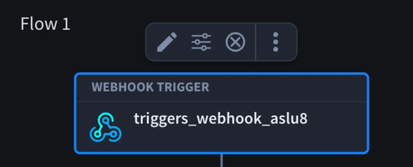
Toolbar Options
Option | Description |
|---|---|
Disable / Enable | Toggles the node on or off without deleting it |
Edit | Opens the node details panel on the right side of the canvas |
Configure | Opens the configuration panel for inputs, outputs, and other settings |
Expand / Collapse | Expands or collapses a component node on the canvas (component nodes only) |
Ungroup | Splits a component back into individual actions (component nodes only) |
Open in Editor | Opens the component in the Component Builder (component nodes only) |
Delete | Removes the selected node from the canvas |
More Options | Opens the full Edit Menu (cut, copy, paste, Group, Ungroup, and so on) |
Behavior
- The toolbar appears only when a node is selected or right-clicked.
- Disable option changes to Enable when a node is disabled. To enable it again, click Enable.
- Disabling an Action prevents it from running when the playbook is executed.
- The Action remains in the Canvas but is skipped during execution.
- This is useful for testing and debugging specific parts of your playbook.
- When an Action is disabled, a “Disabled” label appears at the top of the Action.
- Configure opens the configuration panel where you can edit inputs, outputs, and other settings.
- Edit opens the details panel on the right side of the canvas.
- Trigger nodes show Edit and Configure only (no Disable on the floating toolbar).
Flow Options
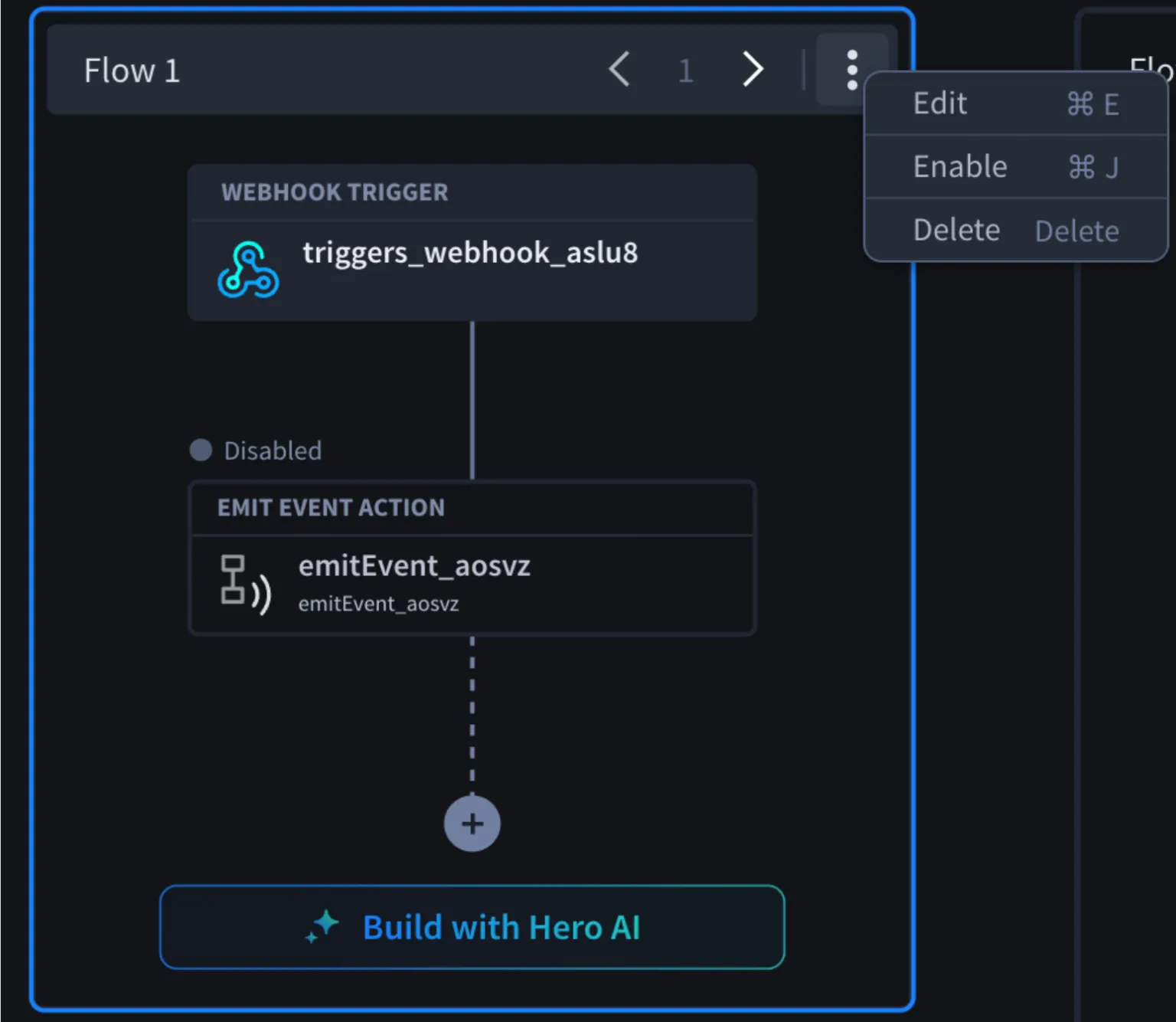
Each flow in a playbook includes a three-dot menu in the top-right corner that provides options for managing the flow.
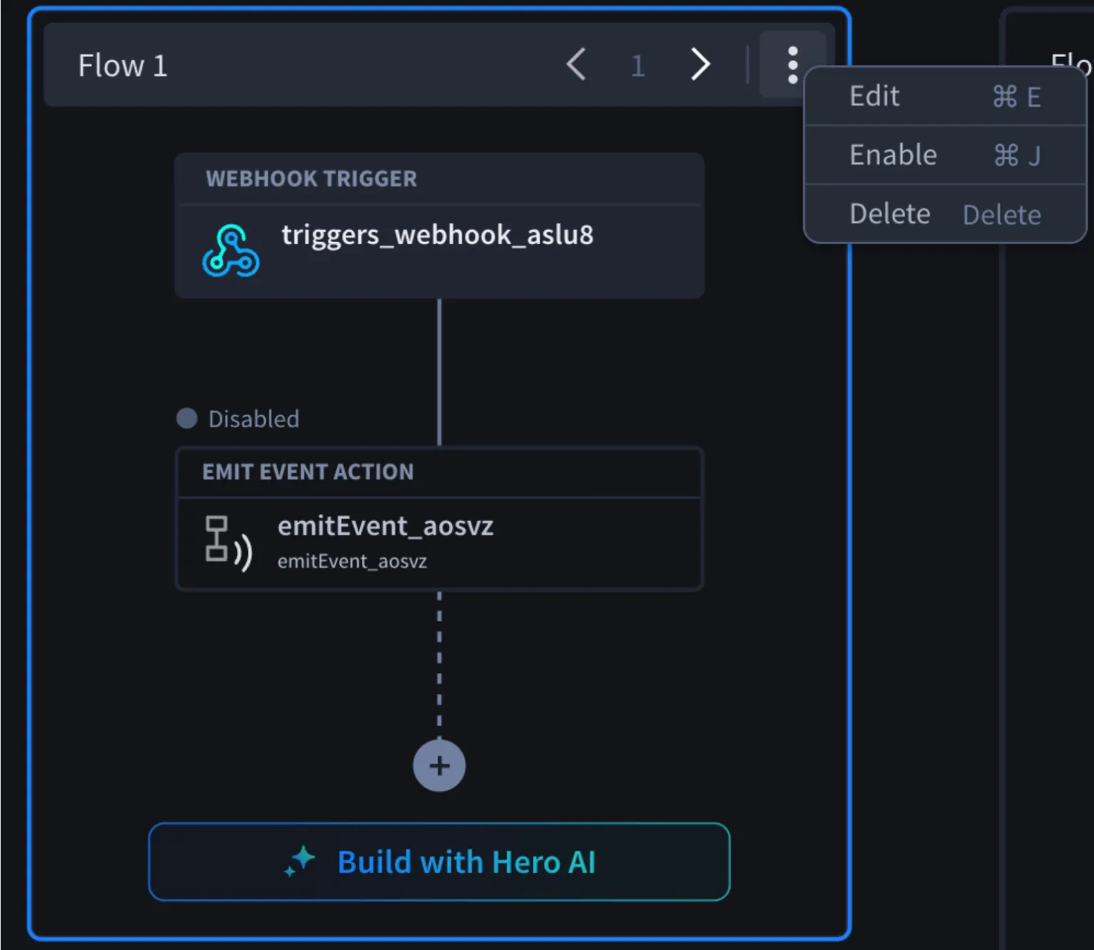
Flow Menu Options
Option | Description |
|---|---|
Move left | Moves the flow one position to the left |
Move right | Moves the flow one position to the right |
Edit | Opens the flow details panel to update name, description, and settings |
Disable / Enable | Disables or enables the flow without deleting it |
Delete | Removes the flow from the playbook |
Behavior
- Reordering flows: Use Move left or Move right button to rearrange flows within the playbook.
- Disable / Enable flow: You can disable entire flows in a playbook to temporarily exclude them from execution.
- When a flow is disabled, a “Disabled” label appears at the top of the flow
- The Disable option changes to Enable
- Click Enable to restore the flow
- Edit flow:
- Opens the Flow details panel
- Allows you to update the flow name and description
- Includes an option to enable or disable the flow
Cut, Copy, and Paste
You can use cut, copy, and paste to quickly duplicate or move nodes and flows within the Canvas.
Basic Actions
Action | Description | Shortcut |
|---|---|---|
Cut | Removes the selected node(s) and copies them | ⌘ X |
Copy | Copies the selected node(s) | ⌘ C |
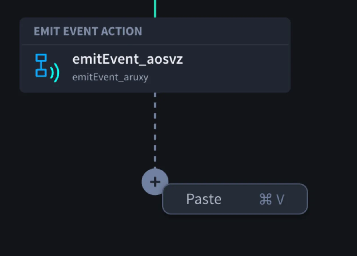
Paste | Pastes copied node(s) into the Canvas | ⌘ V |
How To Paste
- Right-click on the + (plus) icon at the open end of a node in a flow.
- Select Paste to insert the copied content.
Multi-Selection
You can select and work with multiple nodes within a flow at the same time.
Select Multiple Nodes
- Hold down the Shift key
- Click and drag across the Canvas to select a region
- All nodes within the selected area will be selected
Behavior
- Multi-selection works within a single flow only
- You cannot select nodes across multiple flows at once
- Each node is treated independently, even if connected to others
- You can perform actions (copy, cut, disable, Group, and so on) on selected nodes
- Clicking a single node without holding Shift clears the region selection
Copying Between Flows
- You can copy nodes from one flow and paste them into another flow
- Pasting at the end (+ icon) adds the nodes to the flow
- You can paste partial sections of a flow, including connected nodes
Overwriting Content
- If you paste onto an existing Action node, it will replace (override) that node with the copied Action.
- If you paste an entire flow onto another flow, you will see a prompt:
- “Overwrite Flow”
- Options: Overwrite or Cancel
Edge Placements
- You can paste copied nodes at the edge (end) of another flow
- The structure is preserved as much as possible
- If you copy only part of a flow, some Actions may depend on other Actions that were not included in your selection. In this case, you may see the following warning: “Paste warning: Some actions contain references to actions that were not included in the selection. Those references have been marked as deleted.”
- When copying a loop or parallel node, you only need to select and copy the top (parent) branch. All associated child nodes within that structure are automatically included in the copy.
- Review the pasted nodes to ensure they still work as expected.
Canvas Navigation
You can zoom and move around the Canvas to better view and work with your playbooks.
Zoom In and Out
- Use the zoom controls (+ / –) at the bottom of the Canvas
- You can also zoom using your touchpad by pinching (two-finger swipe)
This helps you focus on specific parts of your playbook or view the overall structure.
Move Around the Canvas (Pan)
- Click and drag on an empty area of the Canvas to move around
- You can reposition your view up, down, left, or right
- Flows move together within the Canvas as you navigate
This allows you to manage space and work with large playbooks more easily.
Annotations
Annotations allow you to document the purpose, reasoning, and expected outcomes of actions and workflows directly on the Canvas. Annotations are intended for documentation and knowledge sharing and are not tied to a specific user.
Add an annotation
- In the Canvas tool panel, click Add Annotation.
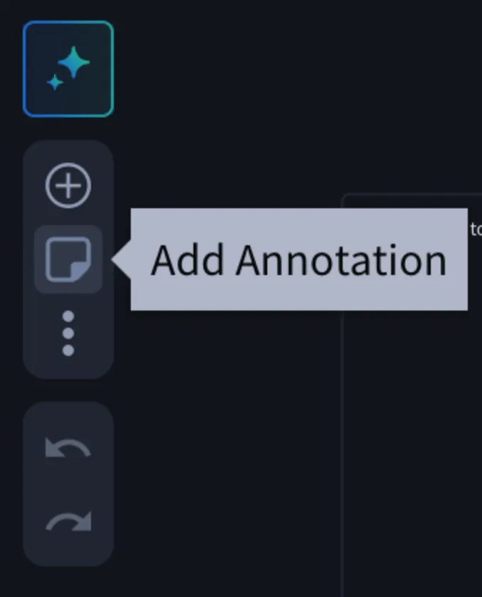
- The cursor changes to an annotation icon.
- Click anywhere on the Canvas to place the annotation.
- Enter your annotation text.
- Press Enter to save the annotation.
- Press Shift + Enter to add a new line within the annotation.
Annotation editor
Each annotation includes an editor toolbar with the following options:
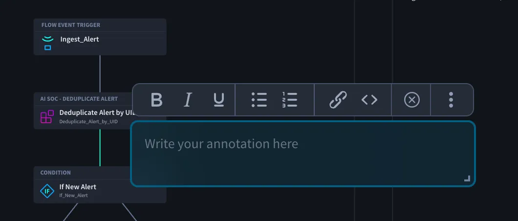
Option | Description |
|---|---|
Bold | Format selected text as bold |
Italic | Format selected text as italic |
Underline | Underline selected text |
Bulleted List | Create a bulleted list |
Numbered List | Create a numbered list |
Link | Insert a hyperlink |
Code Block | Format text as code |
Delete | Remove the annotation |
More Options | Opens additional actions |
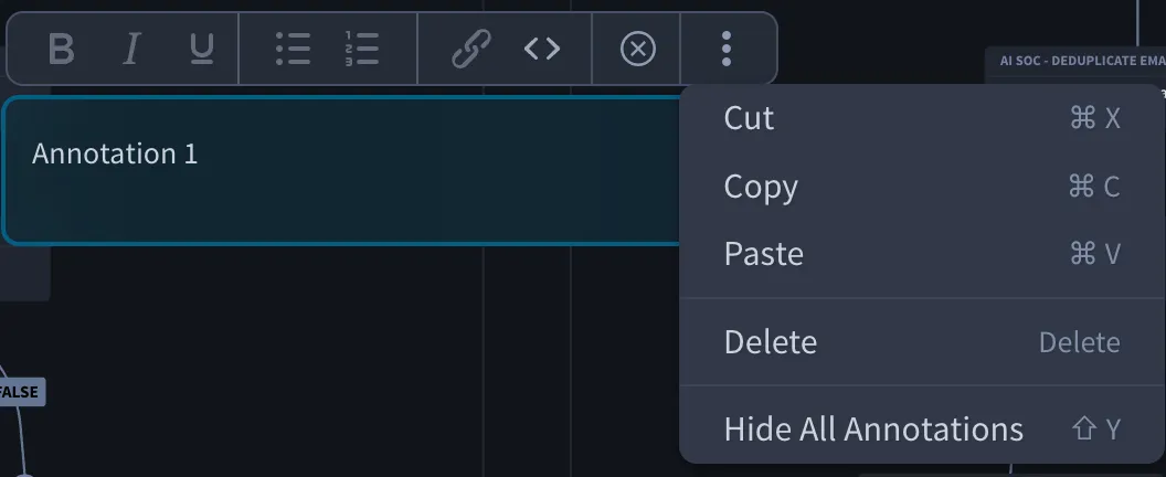
The More Options menu includes:
- Cut
- Copy
- Paste
- Delete
- Hide Annotation
Move and resize annotations
- Click and drag an annotation to reposition it anywhere on the Canvas.
- Drag the resize handle in the lower-right corner to resize the annotation.
- Annotations can be resized up to 500 px wide and 300 px high.
- Scrollbars are available when annotation content exceeds the visible area.
Hide and show annotations
You can temporarily hide annotations without deleting them.
To hide or show all annotations:
- Press Shift + Y, or
- Open the Edit menu and select Hide All Annotations
Selecting the option again restores all hidden annotations.
Annotation behaviour
- Annotations are automatically associated with the nearest node on the Canvas.
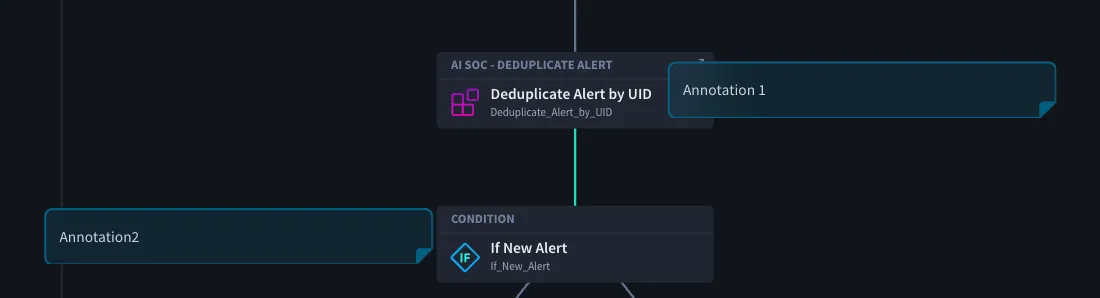
- If the associated node is deleted, the annotation is automatically reassigned to the next nearest node.
- Annotations scale together with the Canvas when zooming in or out.
- Annotation creation, editing, deletion, movement, and resizing support Undo and Redo.
Copy, paste, and grouping behaviour
Annotations can be copied and pasted when they are included in the selected content.
- If an annotation is grouped with the nodes being copied, the annotation is copied and pasted with the selection.
- If an annotation is not included in the selection, it is not copied or pasted.
- When creating a component from a grouped selection, included annotations are added to the component.
- Annotations are intended for documentation and are not comments.
- Annotations are not associated with specific users.
- Component annotations are only visible when the component is opened directly. They are not displayed when the component is used within a playbook.
- Rich text support is limited to basic formatting options. Images, custom fonts, font colours, text alignment, and background formatting are not supported.
Missing or Inaccessible Entities
Starting in Turbine 26.4.0, when you open a playbook or component on the canvas, Turbine still loads the graph even if a referenced object is gone or blocked by permissions. Instead of a blank or broken control, the canvas and configuration panel show placeholders and warnings so you can repair the flow.
This covers common cases after:
- An application, asset, component, connector action, webhook, or flow event was deleted or is no longer available in the tenant
- Your role lacks permission to the resource (for example under Enhanced RBAC)
- A schema or mapping mismatch remains after restoring a previous version, importing an SSP, or changing an external object that the playbook still references
On the Canvas Node
Placeholder nodes keep their place in the flow graph and show a warning tip under the node:
Tip on the node (UI) | Meaning |
|---|---|
Component not available | The component no longer exists or you cannot access it |
Action not available | The connector action no longer exists or you cannot access it |
Webhook not available | The webhook trigger reference is missing or inaccessible |
Flow Event not available | The flow event / sensor reference is missing or inaccessible |
Invalid configuration | The node has configuration or mapping errors (for example a property reference that no longer resolves) |
Invalid configuration can also appear for mapping problems that are not a full missing component—for example a Transform Data (or similar) input that still points at a property that no longer exists. Open the action and fix or clear the invalid reference.
In the Configuration Panel
When you select a placeholder component or connector action, the details panel explains how to recover:
Situation | Message (UI) |
|---|---|
Missing / inaccessible component | This component is empty. Select another component or delete the current node from the flow. |
Missing / inaccessible connector action | This action is empty. Delete the current action from the flow, and drag another action to the canvas. |
Selectors for applications, assets, pools, fields, and properties can show <Entity> not available (for example Application not available, Asset not available, Pool not available, Property not available, Field not available).
Where a hint is shown under the control, it uses:
This <entity> no longer exists or you don't have permissions to view it
(for example: This asset no longer exists or you don't have permissions to view it).
What To Do
- Confirm whether the object still exists under Orchestration (applications, assets, components, connectors) or in Admin / tenant settings (pools, webhooks as applicable).
- If Enhanced RBAC is enabled, confirm your role can read (or otherwise use) that resource — see Enhanced Role-Based Access Control (RBAC)Enhanced Role-Based Access Control (RBAC).
- On the canvas:
- For a component placeholder: open the node and select another component, or delete the node from the flow.
- For a connector action placeholder: delete the action and drag a valid action onto the canvas.
- For Webhook / Flow Event placeholders: reconfigure or replace the trigger with a valid definition.
- For Invalid configuration: open the action and repair mappings, fields, or property references.
- After a version restore or SSP import, walk each flow for warning tips and panel placeholders before you enable or publish.
- Save the playbook or component when references are valid again.
Do not enable or run a flow that still shows not available or Invalid configuration on required steps. Runs may fail or skip steps until references are repaired.
Testing and Run Behaviour
When running or testing a playbook:
- Disabled actions are skipped automatically
- In Test data, disabled actions are marked with a Disabled status (alongside statuses like Success or Failed)
- In Runs, you will see a message:
- “This action was skipped because it was disabled.”